The sporting transfer season my be on hold but QxLab has two new additions for the summer. Every year summer interns join the lab to gain experience working in a research environment.
Last year’s summer intern, Matthew Parker, from Texas Tech University, developed a Unity application for VR experiments using an Oculus Quest to investigate the effect of the spatial audio on the perception of speech. This led to a 2019 publication at AICS. Matthew was in touch to let us know that he has been offered a PhD position beginning later in the year at Rice University.
This year, Khushboo Satpute and Qijian Zhang join the lab from the UCD MSc programme. Khushboo has over 6 years of experience working in academia. She is working on a chatbot system for mental health research using the Google DialogFlow Cloud Platform. This work is in collaboration with Prof. Louise McHugh in the UCD School of Psychology.
Qijian has experience in front end web development and is developing of web-based listening and speech test platform.
This year our interns are the first to experience remote internships due to the COVID-19 campus closure. The lab social Zoom sessions and Slack channels keep us in touch and we hope that they will enjoy their experience working in QxLab.
Many new phrases have entered our vocabulary as a result of the COVID-19 pandemic and lockdown. “Zoom fatigue” refers to the mental exhaustion associated with online video conferencing.
We can change how we interact on video calls with adapted social behaviours such as scheduling shorter meetings. But theories from audio and sound research tell us that a lot of what determines how fatigued you become is based on what you are listening to.
The voices transmitted through the internet in real time are unedited and therefore crude to our ears. That is why we can wile away an hour listening to a podcast interview but feel drained after a video meeting – even if we didn’t have to contribute.
The good news is each one of us can contribute to reducing Zoom fatigue. You can change some simple things to improve everyone’s video meeting experience.
Subtle sounds such as key tapping and swallowing sounds will be captured and amplified through the system. Squeaky chairs, eating crunchy snacks and slurping coffee can sound to the listeners as if you are chewing in their ears.
If you want to limit the negative effect your voice might be having on other callers, the problem is you don’t know what it actually sounds like on their devices. Face to face we can hear ourselves in the same environment as our audience hears us and we adjust accordingly but that’s not possible online.
Step into your listener’s shoes: record a meeting on your own and listen back to understand how others hear you. Something as simple as adjusting the position, distance, or direction of your microphone could make a big difference. Switching from a laptop’s built-in microphone to a headphone microphone can mask a lot of environmental noises such as keyboard clicking or room echo.
Your new social space
While the content and topics of our video conversations may remain the same, we are constrained by the technology. Listening to group chats can be exhausting because we have lost the ways we use “back-channel” sounds to give turn-taking feedback.
Network problems can also impact speech clarity. Data loss in the audio feed can cause unnatural sounding voices and missing sounds. Our brain needs to do extra work to fill in the gaps. We use energy concentrating on unnatural voice changes that divert our concentration from understanding the message.
We must acknowledge the technical limits of video chats and adapt by cultivating new conversation etiquettes. Mute your microphones after saying hello and using text chat to interject or raise questions in group conversations. Articulate your own speech clearly (don’t mumble) and turn on closed captions to aid your comprehension. And make sure someone else in the house is not consuming all the bandwidth for Netflix while you are having a video conference.
Conversations in a household environment bring background noises as well as echoes and reverberation due to room acoustics. Typical background conversations in open-plan offices can easily be filtered out subconsciously by our brain due to its ability to separate sounds by their location or direction.
These spatial cues allow us to focus on a single speaker in a crowded room. This is one reason why side-conversations held in parallel to the main discussion do not work on a video conference. Without the aid of directional information background noises and speech become a lot more intrusive. Rooms at home can produce reverberations that can reduce your ability to understand speech.
To make your home video environment more accommodating, close the door to at least keep pets out, even if it cannot stop kids interrupting. You may not want to convert your living room into a recording studio by putting egg cartons all over the wall but you can make the acoustic environment more “voice friendly” by reducing reverberation and echoes with soft furnishings like blankets or pillows instead of plain walls. The bookcase in the background is not just a pretty prop but also a good acoustic baffle.
Just like social distancing, improving the quality of your video call experience relies on a community effort. As many of us won’t be going back into the office for a long time, we must all work to reduce Zoom fatigue and make calls less of a strain for everyone.
The lockdown has taken away many of our social and leisure opportunities, restricted our travel and our ability to teach and learn in a natural, face-to-face environment. As we struggle to find the headspace to work and draw virtual lines to separate or home and work lives, a few welcome gifts have arrived.
Many companies have provided free or extended access to their online resources such as video streaming services, kids education resources and learning software.
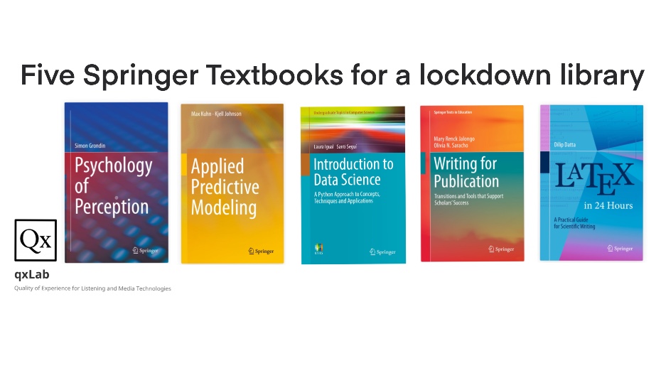
From an academic perspective, the Springer book series that has been made available has provided a new bookcase on my tablet of introductory texts across a range of topics. After a discussion on our lab group #random slack channel, a few books were suggested so I’ve put together a post of the top picks.
For those interested in working in the area of Predictive Modelling for Multimedia Quality of Experience, I’ve put together a top 5 books bootstrap your productivity. New PhD students at QxLab will find this a good place to start.
Psychology of Perception: This book the terminology used in perception and the biological and physical bases required for understanding sensory experiences. The chapter on hearing introduces speech and audio perception touching on phonemes, psychoacoustics and musical notes.
Applied Predictive Modeling: The different ways of implementing regression and classification models are presented. Chapter 20 is a nice introduction to the factors that can affect model performance, highlighting how models may predict something other than the factor you expect.
Introduction to Data Science: Getting familiar with the syntax and libraries of Python, Pandas, Numpy and Scipy through Jupyter Notebooks. Data understanding, preparation and wrangling is the foundation of any good data-driven model so this book gives a good crash course. Especially useful if you come from a MATLAB background and want to get up to speed with Python.
Writing for Publication: Procrastination, aversion to writing, uncertainty and fear of criticism impact us all throughout our research careers so any book that deals with these in chapter one before getting into the difference between conference and journal publications seems good to me. From the benefits of collaborative authorship, to dealing with editors it has a lot of nice tips regarding academic writing that go beyond the concrete advice on first drafts, titles, abstracts etc. which are also covered.
LaTeX in 24 Hours: Learning to use LaTeX is the best way to increase the efficiency of academic writing. Managing citations with BibTeX beats word any day, but using Overleaf for collaborative authoring, commenting and markup for revisions and version control makes it the markup language of academic writing. I never had a book on LaTeX and as with anything the you learn as you go, it is nice to be able to dip in and see chapters containing simple things you’ve never come across before (e.g. chapters 17 and 18 has lots about boxes).
I’ve saved these to iBooks on my iPad so next time I’m looking for a book to browse I have several options at hand.
The paper pulls together all of the subjective QoE experimental work conducted during his PhD research and explores the relationship between different audio and video quality issues and how they influence quality when they interact.
UnB-AV: An Audio-Visual Database for Multimedia Quality Research
The paper describes an open research database of audio-visual sequences and quality scores aimed at multimedia quality research. The database contains a total of 140 source content, with a diverse semantic content, both in terms of the video and audio components. It also contains 2,320 test sequences with audio and video degradations, along with the corresponding quality and content subjective scores. The subjective scores were collected by performing 3 different psycho-physical experiments using the Immersive Methodology. The three experiments have been presented individually in previous studies. In the first experiment, only the video component of the audio-visual sequences were degraded with compression (H.264 and H.265) and transmission (packet-loss and frame freezing) distortions. In the second experiment, only the audio component of the audio-visual sequences were degraded with common audio distortions (clip, echo, chop, and background noise). Finally, in the third experiment the audio and video degradations were combined to degrade both audio and video components. The UnB-AV database is available for download from the site of the Laboratory of Digital Signal Processing of the University of Brasilia and The Consumer Digital Video Library (CDVL).
I spent a lot of the last couple of weeks in bed with an undiagnosed respiratory illness that may or may not have been COVID, so I was not up to doing much other than browsing twitter from time-to-time. I was curious about the research, highlighted by Luke O’Neill and others potentially linking susceptibility to COVID and national BCG vaccination policies.
My first thought, based on a colleagues tweet, was to be wary of thinking you can do epidemiology research.
Yes. Be careful of the “infectious disease epidemiology – how hard can it be” trap. https://t.co/XSp9oFoCqy
Ignoring the wise advice, and driven by curiosity, I decided to bootstrap some code from Barry Smyth and compare the European Centre for Disease Prevention and Control and the BCG world atlas to see if any trend could be visualised.
The results were interesting enough to me to write up and share, although, with the strong caveat that this was a rough exercise by a convalescent non-expert!
Background
The Covid-19 pandemic has resulted in over 1.3 million infections and 300,000 deaths 80,000 deaths between January and the 8th April 2020. Recently published papers suggest vaccination with Bacillus Calmette-Guérin (BCG) could have protective effects against viral infection. BCG has been in use since 1921 [1] and is a safe vaccine that has been shown in some trials to provide some level of protection for other a wide range of pathogens including viruses [2]. A number of randomised clinical trials have begun to investigate whether the BCG vaccine is playing a contributory role in suppressing the COVID-19 pandemic spread [3]. There has been speculation that a higher blanket immunity among the young could be providing a shield for the elderly in some countries, reducing the pandemic mortality rates~\cite{irishtimes2020}. In the interim, studies of the rates of mortality in the population could allow a better population based understanding of potential contributory factors. Zafirakis et al. [4] and [5] examined whether a relationship could be identified between national BCG vaccination programs and the mortality levels reported by countries.
Inspired by Shet et al. [6] who reported a COVID-19-attributable mortality among BCG-using countries as 5.8 times lower [95\% CI 1.8- 19.0] than in non BCG-using countries, this work sought to use existing data and visualisations with a simple linear regression model to illustrate this finding using only the raw daily cases and death statistics statistics and comparing for countries with different BCG vaccination policies.
Data Sources and Preparation
Daily cases and death statistics attributed to Covid-19 was sourced from the European Centre for Disease Prevention and Control. Per country BCG vaccination policy classifications was retrieved from the World Atlas of BCG [7]. The data was processed using scripts based on scripts from Barry Smyth developed to plot visualisations of daily cumulative cases and deaths inspired by the excellent daily update visualisations produced by John Burn-Murdoch of the Financial Times.
The BCG World Atlas categorised the database of policies and practices of the Bacillus Calmette-Guérin (BCG) vaccine from countries all over the world with details on the changes in policy over time. At a high level there are three main country policies: (a) Current national BCG vaccination policy for all; (b) Past national BCG vaccination policy for all; and (c) BCG recommendation only for specific groups or none at all.
More stratified categories from [7] based on the policy commencement year, subset of populations vaccinated, etc. are not considered here. Many other factors such as those considered in the modelling of [6] or other factors such as the levels of immigration, wealth, vaccination take-up and healthcare systems could also play a factor but are not considered.
Rate of increase in Cases and Deaths
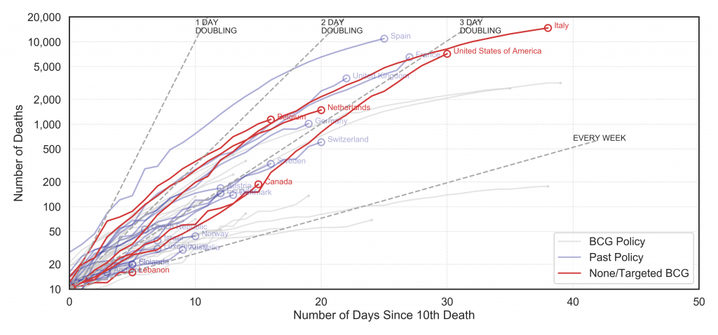
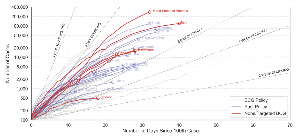
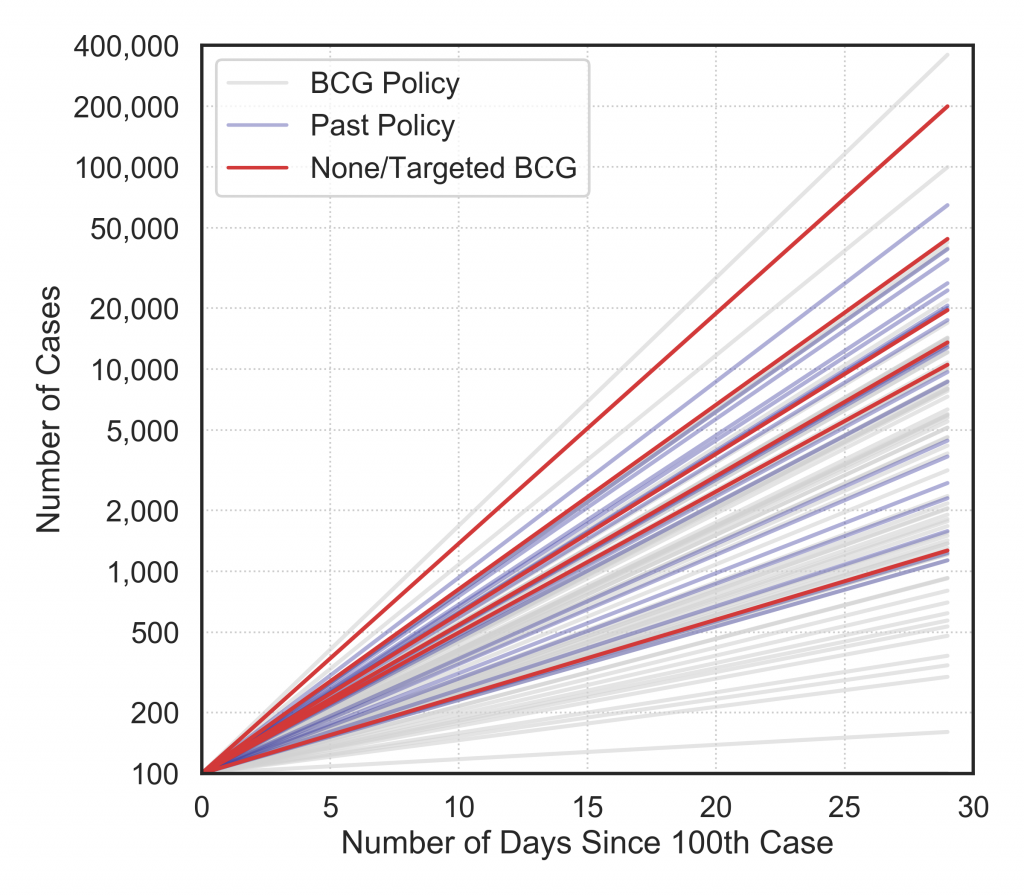
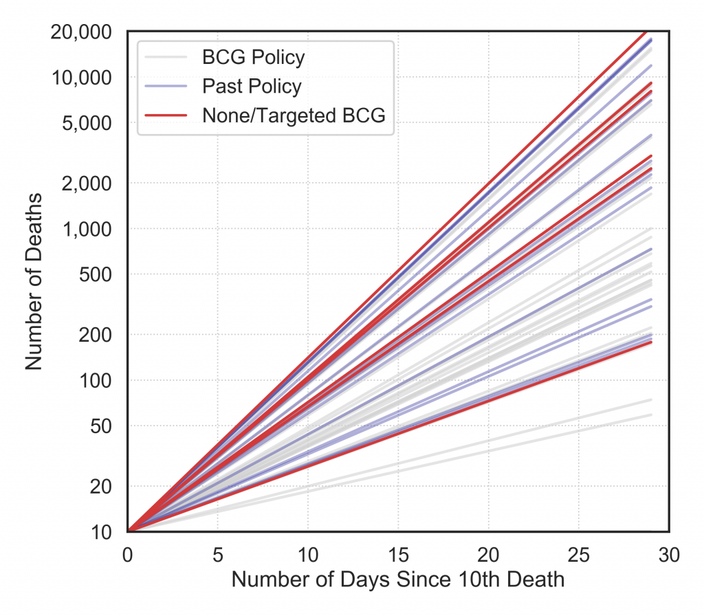
The cumulative cases and deaths per country are plotted, colour-coded by BCG policy class in Fig. 1 and Fig. 2. Both graphs plot the cumulative number of cases per day with a log scaled y-axis. The grey dashed lines show what a trend following an exponential doubling of cases per day, two days etc. would follow. They are plotted from day zero when 100 cases identified in Fig. 1 and 10 deaths occurs in Fig. 2.It should be noted that the reporting on cases varies by country and even within countries as the testing criteria, protocol and capacity change. Hence the daily cases should be treated as unreliable.
Figure 1: Daily cumulative cases by country starting from 100 cases (Data to: 4 Apr 2020)
Figure 2: Daily cumulative deaths by country starting from 10 deaths (Data to: 4 Apr 2020)
In Fig. 2, the cumulative deaths reported are plotted. This data has some of the same quality issues, e.g. deaths outside hospitals are delayed in reporting, are mis-classified or are reported in bulk on a lagging timescale. However, it can be considered better than the cases data in terms of quality.
Looking at both graphs there is a sense that there is a trend that the red and blue lines (i.e. classes with less or no vaccination) are following steeper trends than the grey lines but it is difficult interpret.
Rate of increase in Cases and Deaths
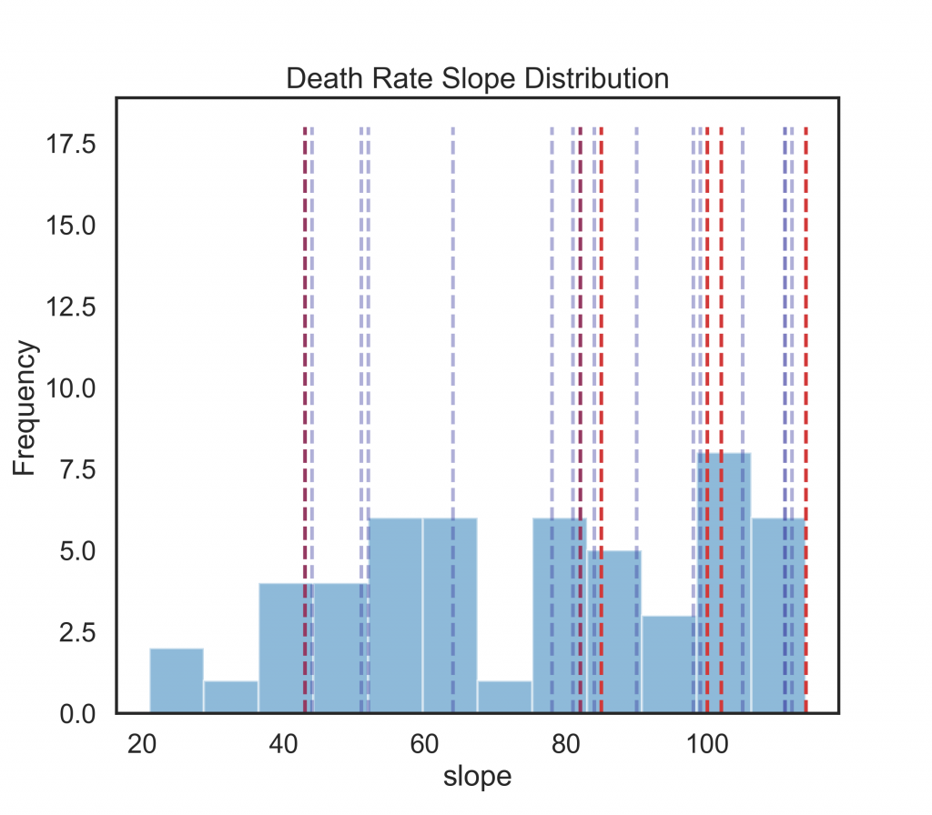
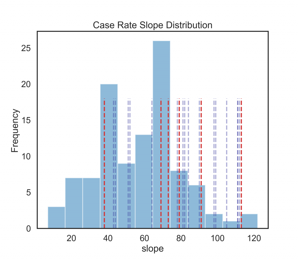
In order to compare across countries in a consistent manner, the maximum slope of the cumulative cases and deaths per country are computed as a linear regression fit over 5 day windows. This gives an indication of the peak rise in cases and deaths. These are plotted in Fig. 3.For both a trend emerges in the red and blue lines (None/Targeted BCG and Past Policy) having steeper trajectories. The outliers are countries like Lebanon and Andorra with relatively low numbers of cases and deaths reported to date.
This data is also visualised in Fig. 4 where the full distribution of slopes are plotted in a 12 bin histogram and dashed lines indicate the slopes of the countries outside of full population vaccination class (a). Again, the cases are noisy but do illustrate the skew. The deaths highlight that all the dashed red lines except one outlier (Lebanon) lie in the top third of the peak slope distributions.
Figure 3: Maximum slope of 5-day sampled linear regression of cumulative daily cases by country.
Figure 4: Maximum slope of 5-day sampled linear regression of cumulative daily deaths by country. The majority of the red and blue lines have a steeper slope than the grey lines for countries with a national BCG policy.
Figure 5: Histogram showing the maximum slope distributions for countries cumulative cases. The red lines show the individual country maximim slope rates for countries with None/Selective BCG vaccination policies; blue dashed lines are countries with past polices.
Figure 6: Histogram showing the maximum slope distributions for countries cumulative daily deaths. The red lines show the individual country maximim slope rates for countries with None/Selective BCG vaccination policies; blue dashed lines are countries with past polices.
Conclusions
It may be simplistic to draw too much from a simple linear regression maximum slope over 5 days analysis. However, the daily COVID-19 case and death statistics reported show a correlation trend with national BCG vaccination policies that is similar to the findings reported in [6]. Followup analysis when the countries that are still in the earlier stages of the pandemic report further cases and mortality may clarify whether the outliers are due to noisy data or significant factors.
References
World Health Organization. BCG vaccine: WHO position paper, February 2018 – recommendations. Vaccine, 36(24):3408–3410, Jun 2018.
Jop Vrieze. Can a century-old TB vaccine steel the immune system against the new coronavirus? Science, Mar 2020.
David Alnwick. Letter to the editor: Struggling to combat Covid-19. The Irish Times, 7 Apr 2020.
Helen Zafirakis Andrew DiNardo Paul K. Hegarty, Ashish Kamat. Bcg vaccination may be protective against covid-19. ResearchGate Preprint, 2020.
Elisabeth Mahase. Covid-19: what treatments are being investigated? BMJ, page m1252, Mar 2020.
Anita Shet, Debashree Ray, Neelika Malavige, Mathuram Santosham, and Naor Bar-Zeev. Differential covid-19- attributable mortality and bcg vaccine use in countries. medRxiv, 2020.
Alice Zwerling, Marcel A Behr, Aman Verma, Timothy F Brewer, Dick Menzies, and Madhukar Pai. The BCG world atlas: a database of global BCG vaccination policies and practices. PLoS medicine, 8(3), 2011.
Two new journal papers recently published by QxLab authors:
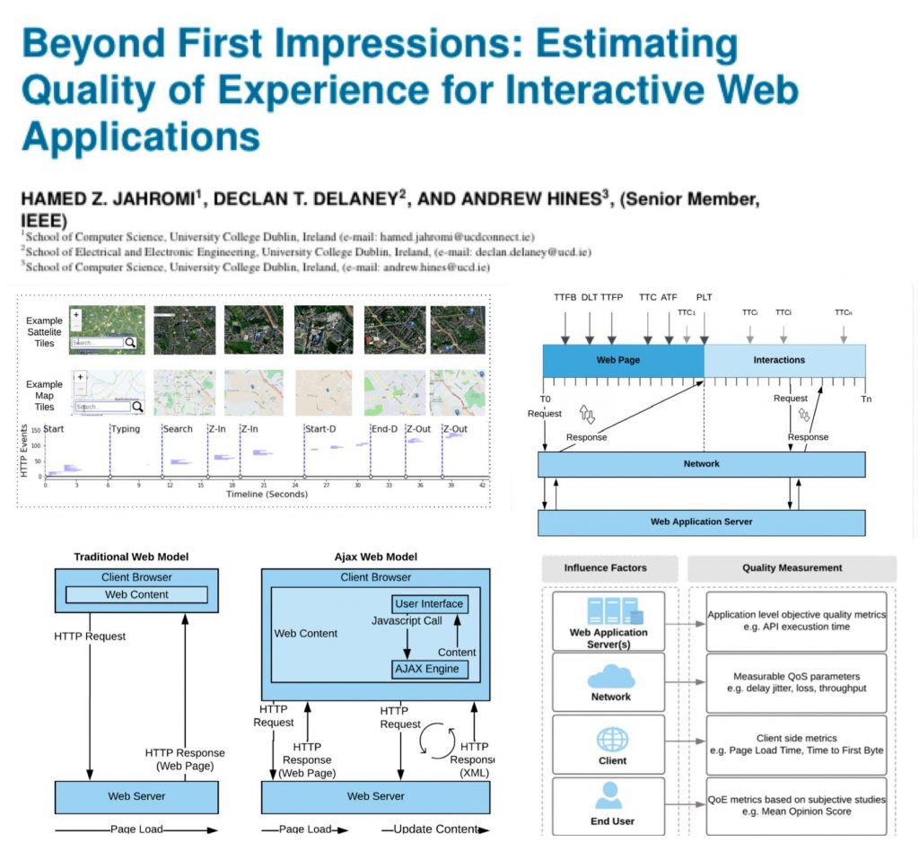
“Beyond First Impressions: Estimating Quality of Experience for Interactive Web Applications” – Hamed Z Jahromi, Declan T Delaney, Andrew Hines
Published in IEEE Access.
What happened when users continue to interact with web applications beyond the first page load? The paper looks at interaction Web Applications, e.g. Google Maps and how QoE can be estimated.
“Assessment of QoE for Video and Audio in WebRTC Applications Using Full-Reference Models” – Boni García, Francisco Gortázar, Micael Gallego, Andrew Hines
Published in MDPI Electronics journal.
An open source benchmarking app that uses Docker containers to evaluate WebRTC quality with full reference quality metrics for video (VMAF, VIFp, SSIM, MS-SSIM, PSNR, PSNR-HVS, and PSNR-HVS-M) and audio (PESQ, ViSQOL, and POLQA).
The latest ACM SIG MM records contains a piece co-authored by Andrew Hines with Niall Murray from Athlone Institute of Technology exploring research parallels for media quality of experience and quality of life. The article highlights work by the Precise4Q consortium on QoL for stroke care and rehab and the relationship with concepts developed for QoE evaluation.
Mapping (a) Quality of Experience to (b) Quality of Life. (reproduced from [1]).
[1] A. Hines and J. D. Kelleher, “A framework for post-stroke quality of life prediction using structured prediction,” 9th International Conference on Quality of Multimedia Experience, QoMEX 2017, Erfurt, Germany, June 2017.
Delighted to announce that QxLab has joined the Precise4Q
consortium. Researchers from the UCD School of Computer Science and based in the SFIInsight Centre for Data Analytics will be working with the
H2020 funded project consortium to develop AI computer models to improve Quality of Life outcomes for stroke patients.
The project aims to develop a platform that will deliver Personalised Medicine by Predictive Modelling in Stroke for better Quality of Life
Stroke is one of the most severe medical problems with far-reaching public health and socio-economic impact. PRECISE4Q sets out to minimise the burden of stroke for the individual and for society. It will create multi-dimensional data-driven predictive simulation computer models enabling – for the first time – personalised stroke treatment. Patients’ needs will be adressed in four stages: prevention, acute treatment, rehabilitation and reintegration.
The team will be focused on predictive modelling applications that aim to maximise the quality of stroke rehabilitation and patient quality of life post discharge.
Alex finalised two journal papers for publication within one week before flying off to present a paper at Globecom – a great outcome by any standards. When you consider that the two papers are a combined 82 pages in length and published in high impact journals, it is an even more impressive feat.
A survey paper requires a different approach to a traditional research paper so we asked Alex to provide a list of writing tips based on his experience:
Define and identify the scope of the paper by listing the topics/dimensions to be covered in the survey paper.
Identify your motivation, exiting challenges and the problem statement to be addressed in the survey paper.
Ensure that the selected topic is popular and is expected to grow over time.
Make sure that your survey paper does not exist in the literature and it will fill a gap in emerging topic(s) of the research field.
Ensure that papers are available in the literature with new approaches regarding the topics discussed in the survey paper.
Before start writing a good comprehensive survey paper, organize a collection of papers (with existing algorithms/methodologies/approaches etc.): authors are advised to read at least 20 – 30 good papers relevant to the topic.
Provide a good classification of available approaches/methodologies, clear and self-explanatory figures and tables in order give readers a good overview of the research topic.
Ensure that the information flow in the survey paper is well connected: this will help the readers and increase the paper visibility.
Provide a summary and lessons learned along with your own commentary for every section: this should discuss the contribution to the knowledge domain from your perspective.
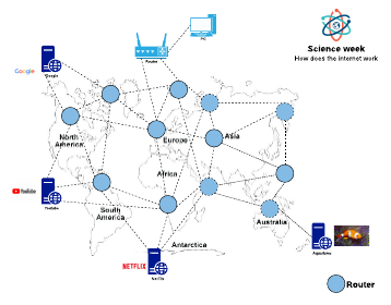
Last week it was science week in Ireland. As part of our communication and outreach engagement, Hamed visited a local primary school to explain how the internet works to a class of eight year old students.
He started by asking the question: “Who knows how a postal package gets delivered?”
He used this example to illustrate the role of routers in computer networks. Once the students understood how routers operate in the networks, they were able to apply their knowledge to an exciting game. Hamed used the game to illustate convergence as kids exchanged paper notes with the location of servers. They also simulated packet forwarding by sending a request from a user to the server and vice versa.


 Published in MDPI Electronics journal.
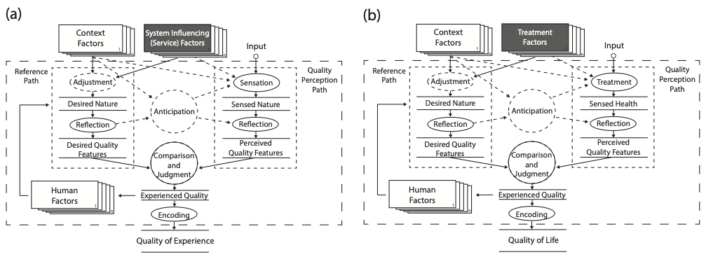


 Last week it was science week in Ireland. As part of our communication and outreach engagement, Hamed visited a local primary school to explain how the internet works to a class of eight year old students.